
From forest green to caramel, these fall wedding colors are absolutely dreamy!
When fall wedding season comes around, it’s hard not to think about the crisp weather and the seasonal flavors. The colors that come with changing seasons make way for the perfect decor palette. It’s no wonder fall weddings are a popular time to get married.
When it comes to choosing your fall wedding colors, it’s important to remember that it’s not just the colors you see in nature (fiery reds, yellows, and oranges). Fall weddings can also incorporate beautiful jewel tones and deep, dramatic hues along with stunning neutrals and earth tones, and there are so many ways to combine shades from each of these categories.
To get the planning started, here’s our favorite seasonal colors to consider for your wedding along with suggestions on what to pair them with and tips for sneaking each shade into your décor in unexpected ways.
01 of 24
Marigold

Making a statement with your color palette is so fun. But when you’re using a bold choice, it’s important to incorporate it in a way that makes the most sense. According to Armstrong, reinforcing the palette with a colored candle is a great way to tie in unexpected colors.
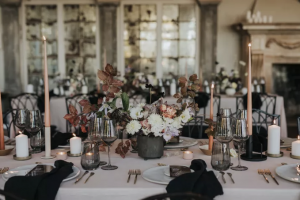
02 of 24
Black
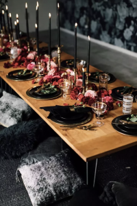
Black isn’t just reserved for tuxes. Add it to your tables with candlesticks or napkins to make your reception table that much moodier. And don’t be afraid to get creative with it. Instead of just going with the expected black-and-white combo, add in some antiqued gold and jewel tones to make your palette a little richer.
03 of 24
Cranberry

Cranberries are harvested in fall, and this hue is the perfect balance between deep red and playful pink. Armstrong suggests that subtle color pops can go a long way when included even in small ways, such as adding a ribbon on a bouquet. Pair cranberry with burgundy or black for plenty of contrast, or work it in as a splash of color with a neutral scheme.
04 of 24
Forest Green

Forest green just screams fall, especially if you’re planning to host an outdoor soirée. But when it comes to forest green, Armstrong warns that it can be a bit tricky, and you may want to consider incorporating it in ways that won’t overdo it. A forest green candle or dark green plates are a stunning contrast to rustic woods or golds. It can also be gorgeous when paired with jewel tones such as a deep burgundy.
05 of 24
Peach

Peach is that perfect orangey-pink color that reminds us of a deeper shade of sherbet, with a little added sophistication. And it’s the ideal shade to add a bold pop of color to a cake or an escort cards display. Pair this shade with earth tones, such as cream, caramel, or even navy blue.
Don’t be afraid to stray from the typical deep, dark tones of fall. Adding an unexpected pop of bright color can make all the difference in setting up a gorgeous color palette you’ll love.
06 of 24
Cornflower

Who says you can’t add a lighter blue to your fall color palette? This color is like a happier shade of denim. Cornflower is gorgeous when utilized in a colored candle or a table linen, and it pairs perfectly with so many other shades. Incorporate natural wood accents, sage greens, or even golden yellows for a stunning combination of colors.
07 of 24
Dusty Rose

Dusty rose is one of the most versatile color options to incorporate into a wedding palette, as it befits any season. A couple may opt to incorporate the shade into the wedding party’s colors, but there are so many other details where it can be added as an accent. Utilize dusty rose in a soft linen runner, napkins, or even a menu to tie it all together. It can be paired with everything from neutral whites and creams to even a bold navy blue.
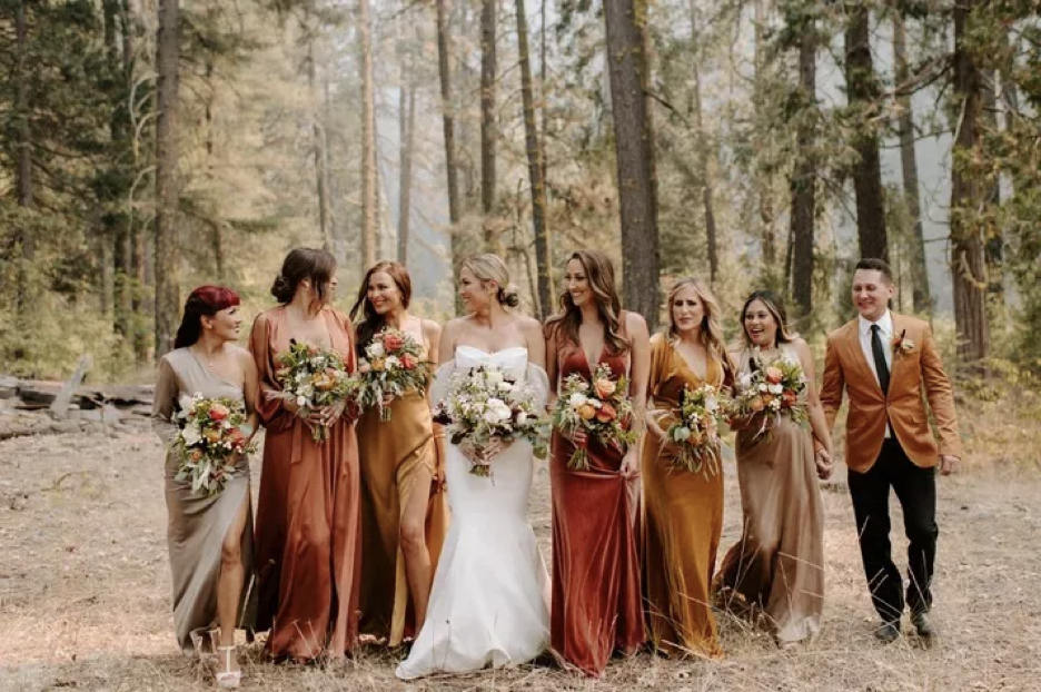
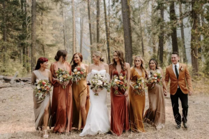
08 of 24
Terracotta

Terracotta is the perfect mix between orangey-red and pink. And while this hue can be used for boho summer weddings, it’s also a beautiful addition to a fall palette when paired with other warm tones of tan or marigold. Terracotta can be utilized in dinner settings or even incorporated when selecting the ribbon for your bouquet.
09 of 24
Navy

Navy can stand on its own as a focal point or be snuck into the details of décor accessories. We love the idea of lining tables with navy bud vases of varying sizes and filling them with a mix of white flowers along with persimmon, red, and crimson hues. Navy is also a gorgeous choice for a bold table linen, providing contrast to other elements on display.
10 of 24
Apricot

Apricot may not be the first color that comes to mind when you think of fall colors. But when you use it alongside surprising pops of burgundy (like in these figs and chocolate cosmos), this typical spring color feels seasonally appropriate. Try incorporating apricot into a bouquet or a statement napkin choice.
11 of 24
Taupe
We love a deep, dramatic taupe and there are so many great ways to incorporate this classic color. Pair taupe with shades of rich purple and lighter shades of gray for a sultry decor scheme. Or use it in simple ways to set the tone for other colors to really shine through.
12 of 24
Pumpkin
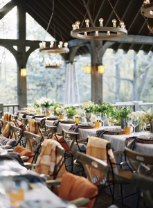
Of course, this is the hue that just screams fall if you’re opting for a truly seasonal, nature-inspired color palette. Add in a touch of pumpkin with cozy elements, such as blankets on your reception seating or accents in your bouquet, and balance it with neutral shades of white, gray, or cream.
13 of 24
Plum
Shades of purple can be tricky when it comes to fall, unless you’re going for a fun, Halloween-themed party with moody hues. But plum might just be the ideal exception, pairing perfectly with darker flowers and gorgeous greenery. Add splashes of this fall shade in the small details, such as decorative elements on your reception tables or to add contrast to your bouquet.
14 of 24
Sage Green

Sage is another one of those wedding palette staples that can work for a sweet, summer garden party, a beach wedding, or a festive fall reception. But the trick is to incorporate it in ways that make the most sense rather than just making an appearance simply because it’s attached to florals.
Pair sage green with simple, natural browns, or make it your main color, paired with whites and creams for a soft statement.
As you plan your color palette, consider the ways greenery will work with other hues as well. While your florals may automatically feature greenery, it doesn’t have to be an afterthought. Work with your florist to be sure your greenery will complement additional tones for a cohesive palette.
15 of 24
Copper
You know we had to get a metallic in the mix. Copper is gorgeous any time of year, but in fall, it really heightens the sensory experience. Copper is stunning in a tablescape whether utilized as a vase to house decadent blooms or to make a subtle appearance in your flatware. It can be paired with earth tones, scarlet, and saffron hues, but it also works well with deep, moody blues and purples.
16 of 24
Marsala

Marsala adds warmth to fall wedding décor without going too deep into the realm of copper if metallic colors aren’t your thing. Incorporate a marsala-hued table linen or colored candle, and pair it with shades of apricot or cranberry, or even bring a stunning teal into the mix.
17 of 24
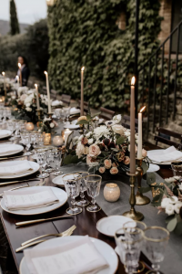
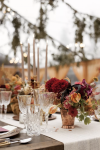
Burgundy

This may just be the most popular addition to a fall wedding color palette—and for good reason. Burgundy can be the star of the show with big, bold splashes in floral choices and reception decor. Or, it can be mixed into the details with warm tones, such as cranberry and peach, to provide both levity and contrast.
18 of 24
Rust
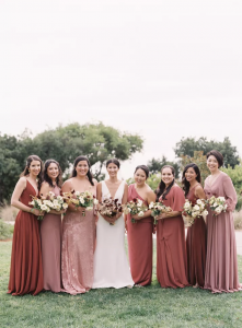
What better way to make a fall wedding feel rustic than to add a rich, rusty hue. Balanced between orange and brown, it’s the ideal way to bring a toned-down shade of orange into any theme. Norwood notes that adding rust into wedding details can make all the difference in a fall color scheme.
19 of 24
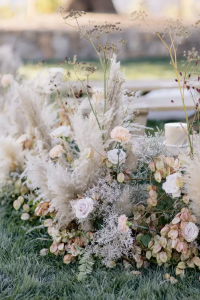
Cream

A truly neutral color palette can be so pretty for fall, especially if you’re planning for golden-hour photos among the trees. Pairing shades of white, subtle yellows, and cream can make for an ethereal combination that goes against the grain of more heady seasonal mixes. This hue can be incorporated into neutral bouquets or utilized when setting the table with airy linens.
20 of 24
Dusty Lilac
Lilac hues are typically considered springtime favorites, but their dusty counterparts are absolutely dreamy in the fall. The muted pastel is a fresh—and unexpected—addition that plays perfectly with earth tones. We love the soft hue in lush blooms or colored candles that either melt into washed-out palettes of oatmeal and taupe or stand out among a bevy of Bordeaux and navy contrasts.
21 of 24
Caramel

Is there anything more quintessentially fall than a warm caramel latte? The depth of this neutral can elevate just about any setting. Consider swapping it in for cream or ivory accents to create a more grounded and earthy vibe.
22 of 24
Charcoal
The smell of a campfire instantly transports us into an autumnal mood. The smokiness of charcoal-hued accents can do the same for a wedding theme. Translucent glassware creates the most captivating use of the color, perfectly showcasing its smoky mystery. Pair with blush tones, deep crimsons, and sweet lilac shades for unexpected depth in a tablescape.
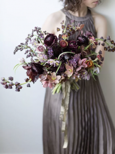
23 of 24
Mauve
There’s something incredibly comforting about a mauve color palette. Technically in the purple family, mauve is a mature tone that can vary from pinkish hues to smoky taupes. As an accent color, it can show up as fluffy blooms, organic linens, or ethereal dress fabrics. It pairs exquisitely with lilacs, pinks, and taupes or grays but can also be amplified with the contrasting freshness of peach. The chocolate cosmos in these bouquets show how brooding tones can also punctuate the color.
24 of 24
Cinnamon

If we could sum up the entire season in one word it would be cinnamon. The scent, the taste, the color—it’s all so decidedly autumnal. Whether you add the delicious hue as a pop or completely indulge in a fully fledged monochromatic theme, we can’t think of a better way to spice up a fall wedding color palette.


Leave a comment